Neutral paint colors have an enduring appeal, offering versatility and a timeless backdrop for various interior styles. Benjamin Moore, a leader in the paint and coatings industry, is renowned for its exquisite range of neutral hues. This article delves into what makes these colors a preferred choice for homeowners and decorators alike, exploring the best Benjamin Moore neutral paint colors.
Neutrals provide a soothing canvas, which seamlessly integrates with diverse design elements and personal styles. With an array of tones and depths available, Benjamin Moore paints can fit into any home aesthetic, from modern to traditional. The popularity of these colors lies in their ability to adapt and elevate a space without overshadowing it.
Choosing the right neutral paint can dramatically transform a room while offering flexibility in decoration and furniture arrangement. A well-selected paint color enhances architectural features and creates a cohesive look throughout a home. This overview will guide you through the top Benjamin Moore neutral colors and how to select the best match for your needs.
How to Choose the Right Neutral Paint Color for Your Space
Understanding Undertones
Undertones play a pivotal role in how colors appear under different light conditions and when paired with other design elements. A neutral’s undertone can range from cool grays to warm beiges, influencing the mood a paint color can create. Selecting the right undertone requires an understanding of the existing elements in your space, ensuring harmony and balance.
The subtle nuances in undertones can significantly affect a room’s atmosphere, often inviting warmth into an otherwise stark space. For instance, a gray with blue undertones may impart a serene, crisp look, suitable for clean-cut modern interiors. On the other hand, warmer undertones can offer a more inviting, cozy feel, perfect for family areas like living rooms and bedrooms.
To accurately identify undertones, it’s advisable to test colors on walls and observe them under different lighting conditions. This nuanced choice ensures that your neutral color complements rather than clashes with furnishings and decor. By appreciating the role of undertones, you’re equipped to make informed decisions that enhance your interior spaces with Benjamin Moore’s neutral palette.
Lighting Considerations
Lighting plays a crucial role in the showcasing of paint colors, particularly neutrals, which can look vastly different in varied settings. Natural light brings out the warmth or coolness of paint tones, varying with the time of day and season. When selecting a neutral paint color, it’s vital to observe how different lighting conditions can influence the appearance of the chosen shade.
The direction a room faces can affect natural lighting significantly. South-facing rooms benefit from warm, consistent light, making warmer neutrals suitable. Conversely, north-facing rooms might need warmer undertones to counteract cooler light. Benjamin Moore’s wide neutral selection offers options for every lighting scenario, ensuring that your chosen shade serves its purpose beautifully.
Besides natural lighting, artificial light sources create differing effects. The color temperature of bulbs—whether warm or cool—can alter a paint’s impact. Testing samples under the lighting scenarios present in your space can help ensure the paint functions as anticipated, maintaining the desired mood and ambiance across varying illumination conditions.
Matching with Room Elements
When selecting a neutral paint color, it is essential to consider the existing elements in your room, including furniture, flooring, and decor accents. These components influence how a color will look in context and its overall effect. Choosing a shade that complements your room’s elements can facilitate a cohesive and visually appealing environment.
For instance, a soft gray might beautifully complement modern steel and glass furniture, creating a sleek, cohesive look. In contrast, a warm beige may pair well with a more traditional setup featuring wood tones, enhancing the space’s warmth and welcoming aura. Benjamin Moore’s neutrals offer the adaptability necessary for matching diverse design styles and tastes.
Coordinating paint colors with room elements also provides an opportunity to highlight or downplay certain architectural features. Neutrals can beautifully accentuate crown molding, framing the design while allowing flexibility in how you accessorize the room. This ability to unify and balance makes Benjamin Moore’s neutral paint colors a staple in interior design.
Accent Color Pairings
Pairing neutrals with accent colors is an excellent way to infuse character and interest into a space. Accent colors bring a room to life, offering contrast and an opportunity for personalization. Benjamin Moore’s neutral palette provides a foundation upon which vibrant or muted accent tones can be added to enliven the environment.
Choosing the right accent involves considering the mood you wish to evoke. Light, airy spaces may benefit from soft pastels or muted earth tones, which offer subtle shifts in color, enhancing the tranquil ambiance. Alternatively, introducing bold colors like deep blues or rich reds can create a dynamic, sophisticated effect when paired with neutrals.
Accents can be included through various elements such as throw pillows, artwork, or even a feature wall painted in a contrasting color. The key is balance, ensuring accents complement rather than overpower the room’s overall design. Understanding these dynamics can help you maximize the impact of Benjamin Moore neutrals while reflecting individual style preferences.
Overall Atmosphere
The choice of a neutral paint color significantly contributes to the atmosphere of a room, influencing its functionality and emotional impact. Neutrals can create anything from calming, serene spaces to vibrant, lively rooms based on their shade and tone. Considering the purpose of the space helps in selecting a color that aligns with your desired atmosphere.
For spaces intended for relaxation, like bedrooms or reading nooks, softer neutrals with warm undertones can be instrumental in creating a lull of tranquillity. This focus on ambiance not only aligns with daily activities but also enhances the overall living experience. For active areas like family rooms or kitchens, neutrals with a hint of vibrancy can stimulate social interaction and energy.
The ability to customize a room’s mood through paint cannot be overstated, with Benjamin Moore offering countless possibilities through their extensive palette. By selecting colors that align with functional demands and esthetic aspirations, you ensure that each room speaks its unique narrative while maintaining cohesion across your home.
What Are the Most Popular Benjamin Moore Neutral Colors?
Ballet White
Ballet White, a light, warm neutral, is cherished for its soft elegance and versatility across various interior styles. This shade offers a delicate balance, making it an ideal backdrop for both contemporary and traditional settings. Its subtle warmth exudes comfort, seamlessly integrating into a room without competing for attention.
This color is particularly favored in spaces where tranquility and calmness are desired, such as living rooms and bedrooms. Ballet White’s understated sophistication allows for an array of accent colors that highlight personal style while maintaining a cohesive backdrop. The hue is equally effective in open spaces, reflecting light beautifully to enhance room dimension.
As part of the Benjamin Moore neutrals collection, Ballet White provides the adaptability needed for evolving design tastes. Its popularity stems from the ease with which it complements modern and vintage elements alike, offering homeowners a versatile yet timeless option for their walls. It remains a top choice among designers seeking elegance in simplicity.
Classic Gray
Classic Gray is celebrated for its understated elegance and ability to transform a room into a calming retreat. This versatile neutral complements a range of decor styles, providing a refined look that underscores simplicity. Its pale tone lends spaces a serene quality, ideal for those seeking a tranquil ambiance in their homes.
The subtlety of Classic Gray makes it an excellent option for open-plan areas, harmonizing different functional spaces without imposing stark transitions. The hue complements natural lighting, expanding a room’s perception and enhancing brightness. Rooms bathed in natural light showcase Classic Gray’s slight warmth, adding depth without overwhelming other decor elements.
Classic Gray’s adaptability allows for creativity in accent pairings, from soft pastels to bold, contrasting shades. Its neutrality does not compete with design schemes, thus fostering an environment conducive to relaxation and unwinding. Benjamin Moore’s Classic Gray caters to sophisticated tastes, blending unassuming charm with the modern preference for peaceful, harmonious living spaces.
Revere Pewter
Revere Pewter is a celebrated choice within the interior design community, known for its balanced blend of gray and beige undertones. This welcoming hue is the epitome of modern elegance, offering a neutral canvas that supports various design aesthetics. Its mid-tone depth adds character, making it appealing for homeowners seeking more than the usual neutral palette.
In living spaces, Revere Pewter serves as a sophisticated backdrop, accommodating both minimalistic and ornate furnishings. This paint color excels in rooms where warm undertones can counteract cooler lighting, fostering warmth and cohesion. It is a favorite for transitional spaces, smoothly linking different areas with its balanced sophistication.
The versatility of Revere Pewter extends to its compatibility with a wide range of accent colors. It provides a grounding effect, allowing bolder colors to pop without overwhelming the senses. As an iconic choice within the Benjamin Moore collection, it is favored by those looking to infuse depth and essence into their interiors while maintaining an air of modernity.
Edgecomb Gray
Edgecomb Gray is known for its subtle charm and transitional shade that bridges warm and cool undertones. Its adaptability to various lighting conditions makes it a popular choice for diverse interiors, providing a versatile solution for the indecisive decorator. The color’s muted tone ensures it complements rather than competes with existing decor.
This Benjamin Moore staple works exceptionally well in areas seeking a gentle lift and sophistication without drastic color changes. Its easygoing nature works harmoniously with both traditional and contemporary furnishings, demonstrating the breadth of its aesthetic appeal. Edgecomb Gray’s capacity to balance light and shadow adds visual interest to rooms.
The color’s neutrality invites decorative creativity, enabling designs highlighting other design elements like moldings or art. Additionally, its subtle beauty is conducive to creating understated elegance, meshing effortlessly with textiles and accent furniture. As such, Edgecomb Gray remains a preferred choice for decorators aiming to maintain sophistication through subtlety.
Cloud White
Cloud White is synonymous with purity and simplicity, revered as one of Benjamin Moore’s most favored white paint colors. Its subtle undertones imbue warmth and softness, creating an inviting atmosphere that revitalizes any space. This popular choice is noted for its ability to enhance light, expanding the perception of space and brightness in interiors.
Perfect for creating an airy, open feel, Cloud White is often utilized in small spaces or rooms with limited natural light. It acts as a blank canvas, allowing personalized decor to shine while maintaining a fresh and clean aesthetic. The color’s adaptability extends to diverse interior styles, from minimalistic to farmhouse designs.
Cloud White’s versatility makes it suitable for all areas of the home, ensuring continuity and flow across multiple rooms. Its soft, understated elegance supports balanced contrast with bolder hues, offering endless possibilities for accent colors. As a trusted neutral, Cloud White continues to grace homes with its enduring appeal, crafted to suit a myriad of design needs.
What Are the Best Neutral Paint Colors for Different Rooms?
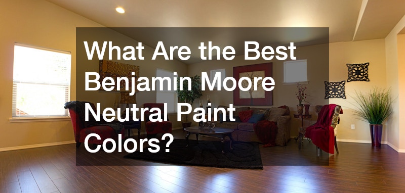
Living Room Options
In the living room, neutrals play a crucial role in setting a welcoming tone while allowing flexibility in decor and furnishings. The living room serves multiple functions, from hosting gatherings to relaxing alone, requiring colors that can accommodate these diverse needs. Benjamin Moore’s range of neutral colors provides an array of options that enhance the comfort and style of this central space.
Neutral tones like Revere Pewter or Classic Gray can effectively enhance the eclectic mix of personal items and design elements typically present in living areas. These colors offer warmth and depth, creating a grounded ambiance that invites interaction while still offering a restful environment for solitary moments. The balance offered by neutral tones ensures that any pops of color through decor items are harmonious rather than jarring.
Choosing the right neutral for a living room often hinges on lighting conditions and existing furniture. Light neutrals can expand the room visually, creating an airy atmosphere, whereas darker neutral tones add coziness and sophistication. Whether your living room is flooded with natural light or relies on artificial sources, Benjamin Moore’s extensive neutral palette ensures a suitable choice that maintains the room’s function and aesthetic continuity.
Kitchen Neutrals
Kitchens benefit from neutral paints that provide a clean, fresh environment, conducive to the room’s primary function as a workspace and gathering spot. Benjamin Moore neutrals offer a robust selection tailored to fit kitchens, where functionality meets style. Consider hues like Edgecomb Gray or Cloud White, which lend kitchens a sense of spaciousness and cleanliness.
The versatility of neutral colors allows them to seamlessly integrate with cabinetry, countertop materials, and appliances, creating a cohesive and uniform look. Light-toned neutrals reflect light effectively, enhancing visibility and making kitchens feel larger and more open. These characteristics are especially beneficial in smaller kitchen layouts where maximizing space is essential.
Incorporating neutral colors also provides flexibility for accessorizing with vibrant kitchenware or other decorative elements. The ability to integrate bold accents such as colorful backsplashes or patterned textiles allows homeowners to personalize their spaces while keeping the overall design streamlined. Benjamin Moore’s neutrals ensure kitchens remain inviting and functional, fulfilling both aesthetic and practical demands.
Bedroom Selections
Bedrooms are personal retreats where Benjamin Moore neutrals have the opportunity to showcase their calming and comforting qualities. In this restful haven, colors like Ballet White or Classic Gray can set the stage for a serene environment conducive to relaxation and unwinding. These hues offer a soft touch that avoids overwhelming the senses, essential for areas devoted to rest.
The effect of neutral colors in the bedroom is twofold: they provide a soothing backdrop while allowing personal touches such as linens, artwork, and furniture to stand out. The tonal subtleties of neutrals encourage a peaceful ambiance, which is crucial for restful sleep and rejuvenation. Utilizing neutrals ensures harmony, catering to diverse tastes with the flexibility to accommodate various design visions.
Bedrooms often reflect individual personalities, and neutrals facilitate this expression by providing a canvas for bold or muted accents. Whether through textiles, decorative accessories, or lighting, personal touches can pop against the stable, serene backdrop of neutral walls. This balance creates a thoughtful and tailored bedroom environment, aligning with the general pursuit of creating a comforting, enjoyable living space.
Bathroom Favorites
Bathrooms, often smaller and unwitting in luxury elements, benefit greatly from neutral paint colors provided by Benjamin Moore. These versatile hues enhance cleanliness and tranquility, with Shell White and Cloud White standing out as particularly popular choices for these intimate spaces. Neutrals work aptly in bathrooms, ensuring the room feels bright no matter the square footage or lighting situation.
In small spaces like bathrooms, neutrals help extend the room visually, especially when paired with reflective surfaces like mirrors or glass tiles. These colors emphasize an airy feel without sacrificing warmth or inviting starkness. The neutral backdrop also allows for cohesion throughout the room, supporting a seamless look from wall tile to cabinetry.
Furthermore, bathroom design trends often include playful or intricate tile patterns, making neutral wall colors an ideal choice for balance. Accents can also be confidently introduced in accessories such as towels and storage solutions, providing necessary contrast without detracting from the room’s fresh aesthetic. Benjamin Moore’s neutral hues endorse simplicity, underscoring the elegance and functionality of bathroom spaces.
Office Spaces
In home offices, choosing the right neutral can significantly impact productivity and focus, a critical consideration as work-from-home setups become more common. Benjamin Moore’s neutrals offer a palette that supports creativity and concentration, with tranquil tones like Classic Gray or Edgecomb Gray being excellent choices for these functional spaces. These colors create a calming environment that reduces distractions.
A neutral backdrop in an office can support various decor styles and personal touches without overwhelming the space. It provides a flexible canvas that promotes focus, allowing workers to adorn their surroundings in a way that aids productivity. Pairing neutrals with strategic pops of color can enhance energy, keeping the office environment dynamic yet focused.
Neutral paint also performs well under different lighting conditions, ensuring that the office remains conducive to work at any time of day. As the demand for ergonomic and visually pleasing home offices grows, Benjamin Moore’s collection accommodates diverse work styles. Choosing a neutral palette facilitates efficient workspaces, aiming for both practicality and aesthetic satisfaction.
How to Test Paint Colors Before Committing
Using Paint Samples
Testing paint samples is a critical step in achieving the desired look for your space, allowing for practical evaluation before full commitment. By assessing how a color responds to your home’s specific lighting and decor, you can ensure that the choice aligns with your expectations. Benjamin Moore provides sample pots, enabling homeowners to paint swatches on walls for real-world observation.
The advantage of using samples lies in the ability to witness subtle undertone shifts and overall interplay among elements such as furniture and room fixtures. Place painted swatches on multiple walls to observe variations in appearance throughout the day, factoring in both natural and artificial light. This proactive approach minimizes surprises and aids in achieving your ideal color.
Thoroughly examining samples also imparts confidence in the final decision, leading to a greater satisfaction with the completed project. Knowing that a color performs as anticipated ensures seamless integration into your living environment. Taking the time to test samples is a testament to attentive planning, promising outcomes that exceed mere surface appeal.
Paint Swatch Techniques
Incorporating paint swatches as part of the color selection process assists in visualizing potential outcomes and narrows choices effectively. Card-holder swatches can be placed against existing room elements, offering an instant comparison that light-box simulation simply can’t replicate. This technique supports informed decisions that consider the full spectrum of color interaction within the space.